Fanatical – better bundle experience leading to increased conversions
Fanatical is a leading video game retailer with over 1 million monthly unique visitors, is seeking to improve it's e-commerce experience for the Build Your Own Bundle product, a key selling point for the platform.
Contribution
Product Design
User Interview
User Research
A/B Testing
Team
Product Manager
Developers
Data Analyst
Business Goals & Requirements
BYOB (Build Your Own Bundle) is our key selling point, and while it's highly effective for existing customers, we've consistently faced challenges in converting new users. We suspect that the page's complexity may be difficult for new customers to engage with preventing them from buying games.
The core aim of the redesign is to provide a clear, engaging, and intuitive user experience, ultimately leading to increased sales and customer satisfaction.
Core goals
Attracting new customers
Maximising sales and revenue
Optimizing user experience
Encouraging repeat purchases
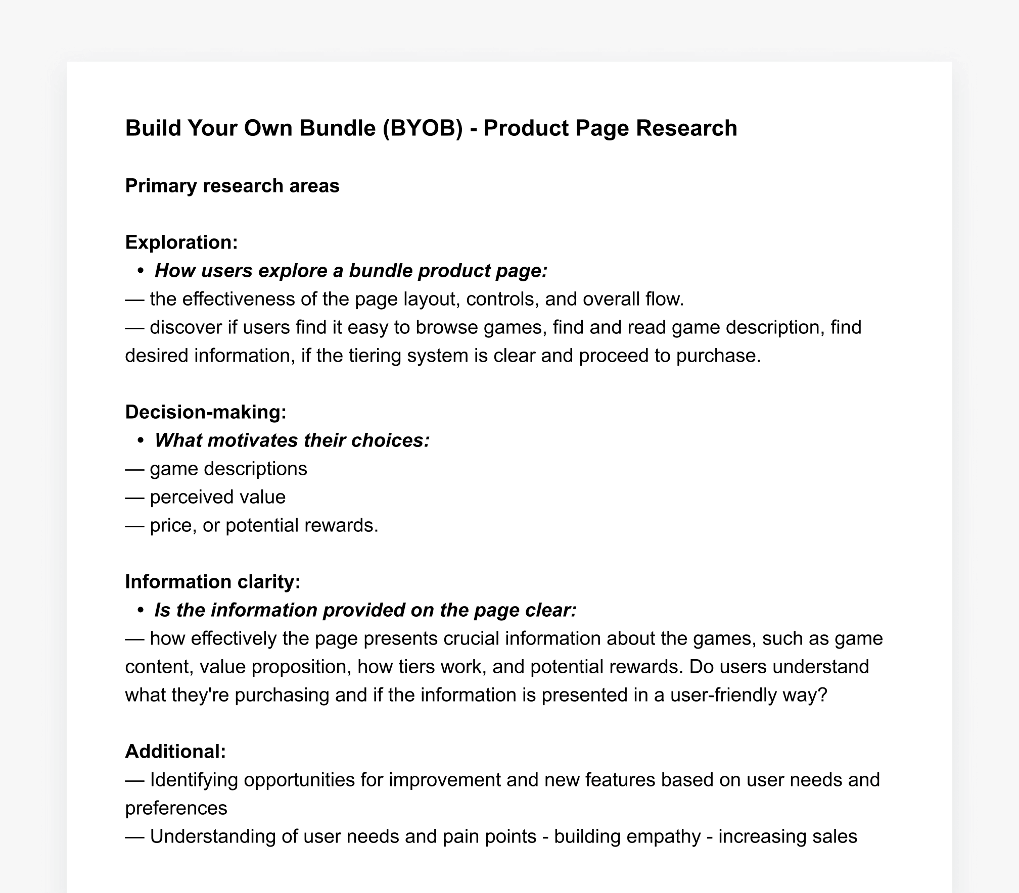
To better understand all concerns before redesigning the page, we decided to gather user feedback through research.
Research
User research
Along with the PM I conducted a user research study. Participants were asked to simulate creating their own bundle from start to cart. Key findings were presented in a BYOB research deck to other stakeholders.
Following the usability testing, we also conducted a brief survey. The survey questions were based on insights from the usability portion, allowing us to gather quantitative data to complement our existing qualitative data. The usability testing was conducted with six PC gamers.
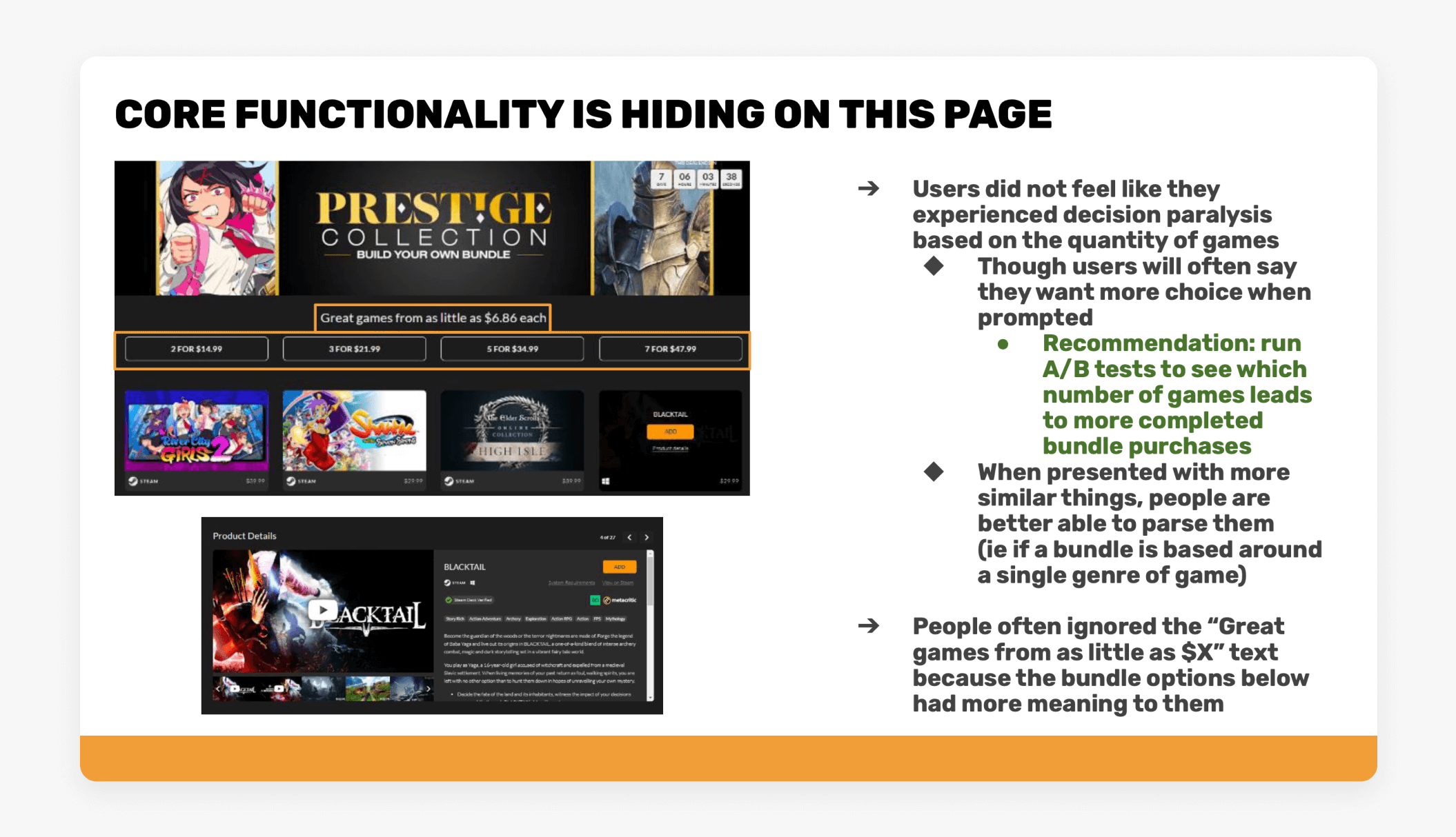
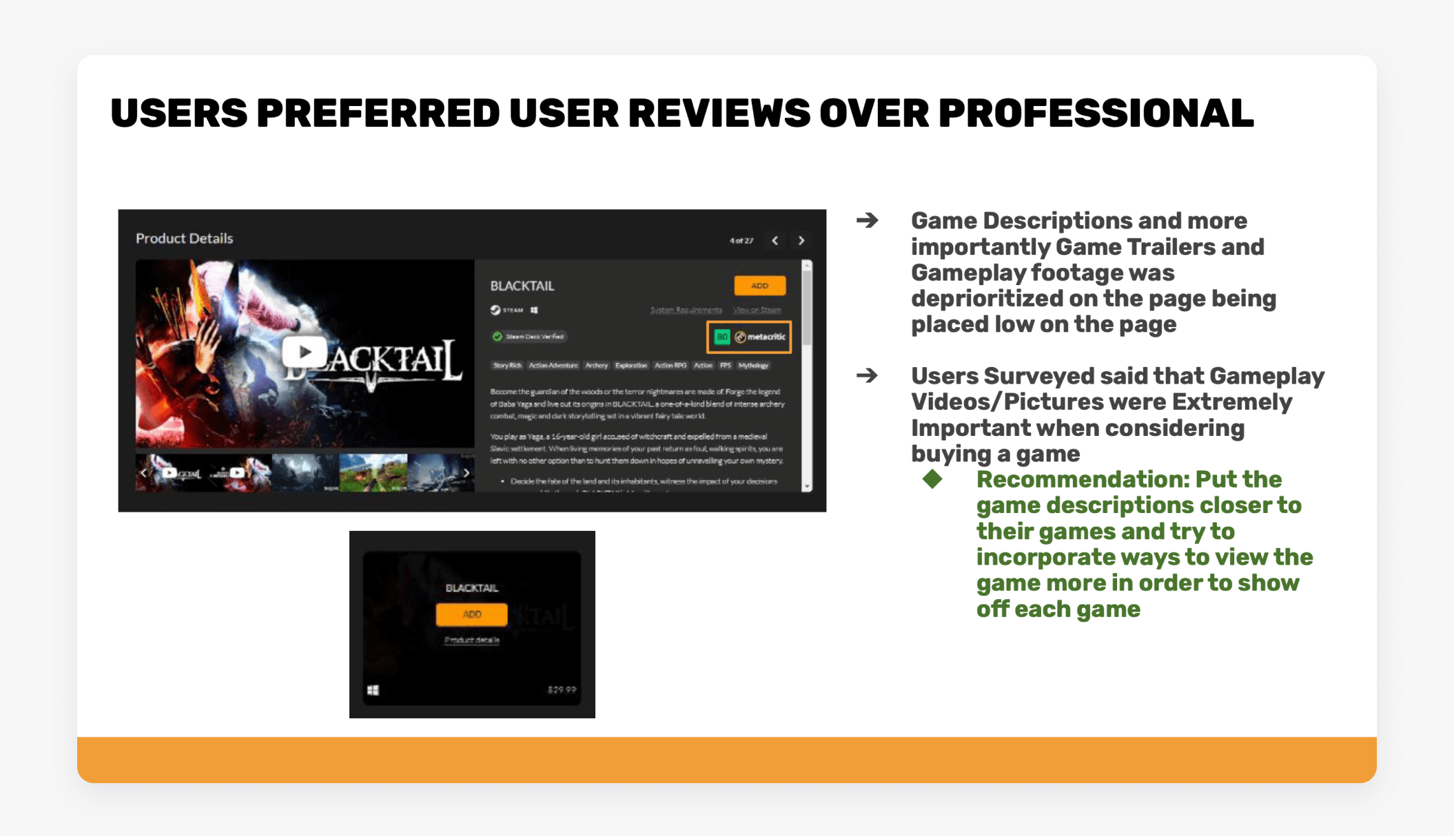
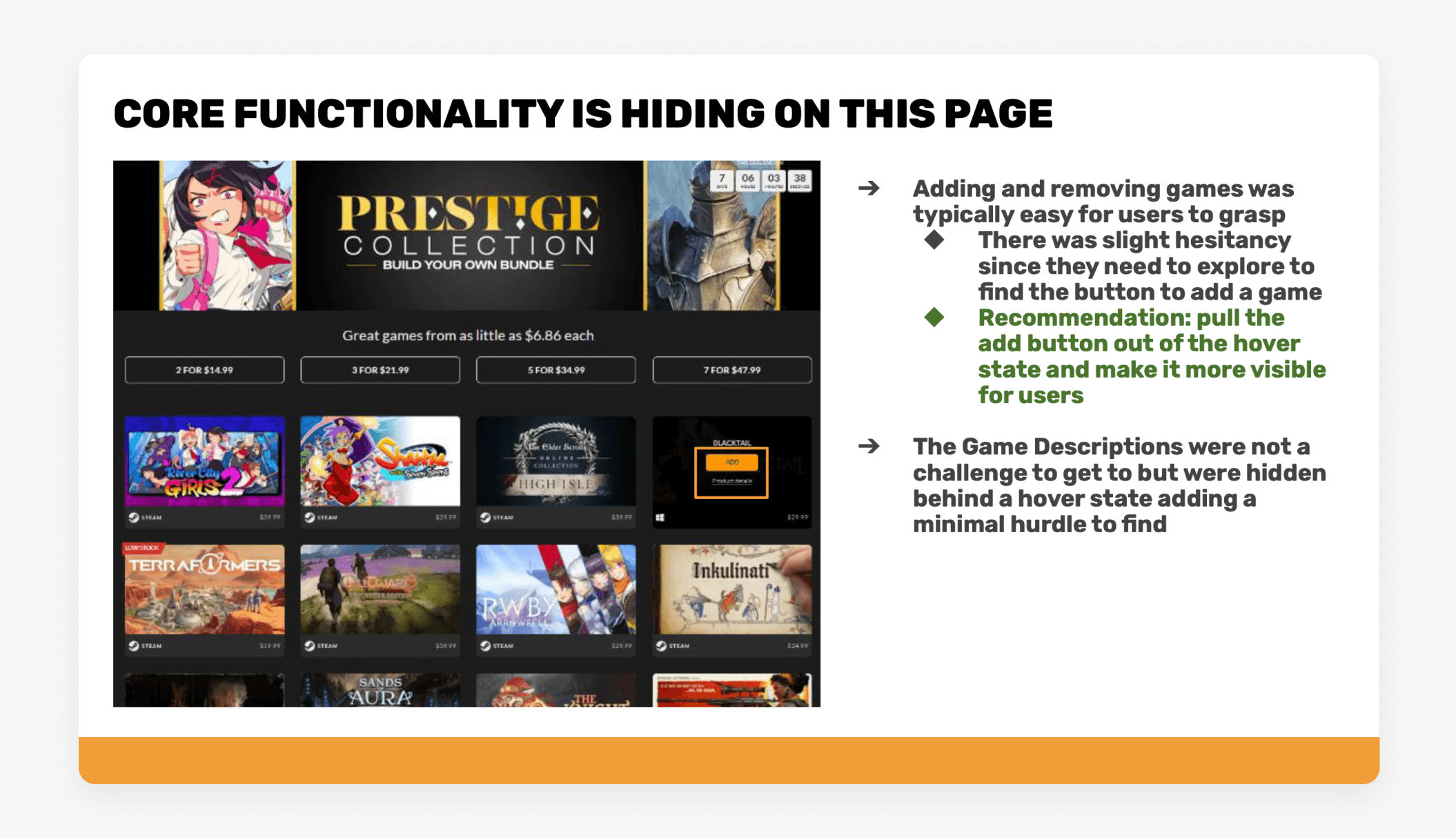
The insights from user interview were presented to all stakeholders in deck:
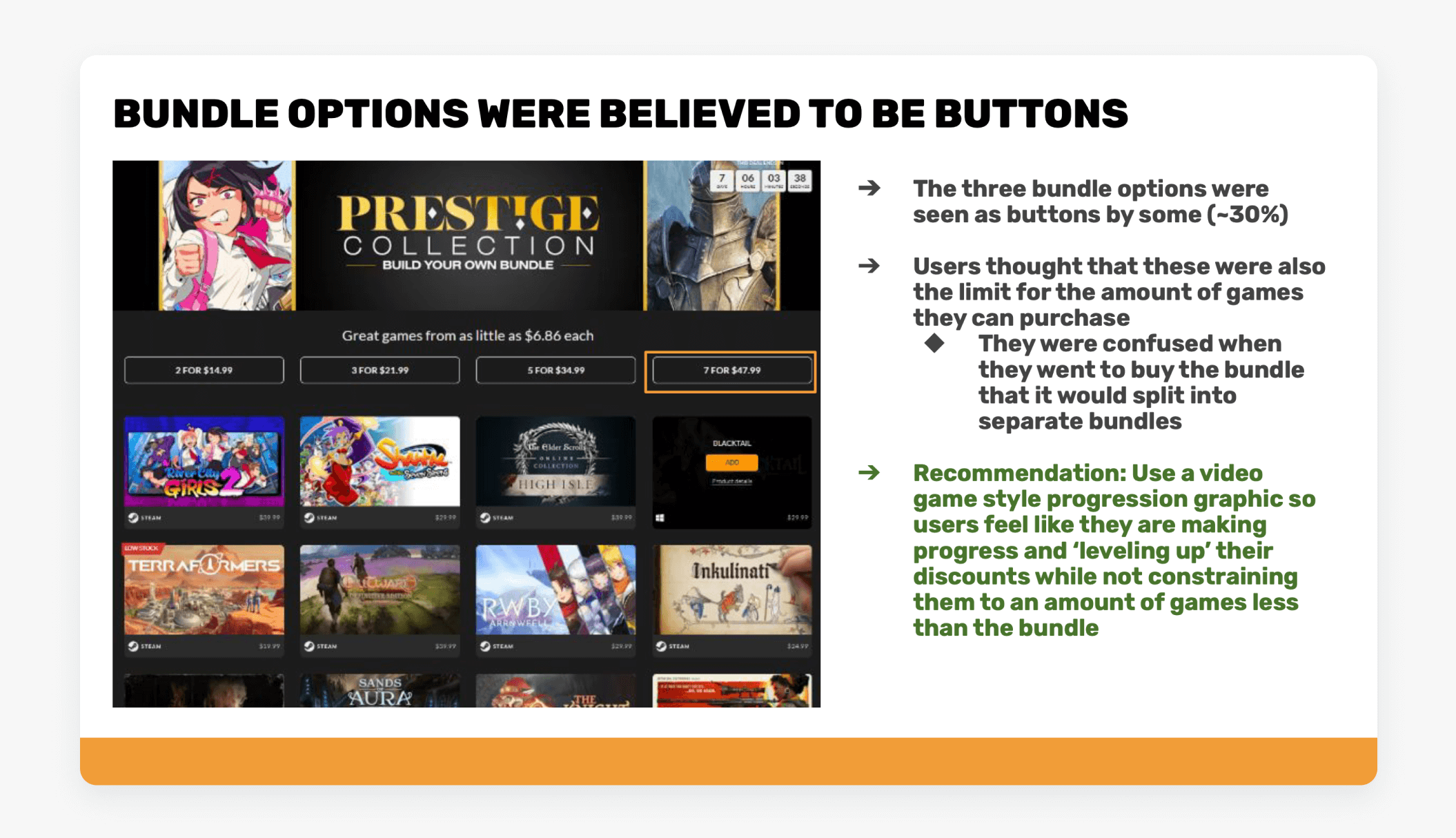
Key findings
Fold optimisation: investigate displaying featured games above the fold
UX improvement: prices options - looks like button
Game cards: select/remove mechanic
Reconsider the flow of “product details”: currently it anchored to the bottom’s carousel
In cart experience: group items that belong to one bundle giving an opportunity for a quick edit bundle
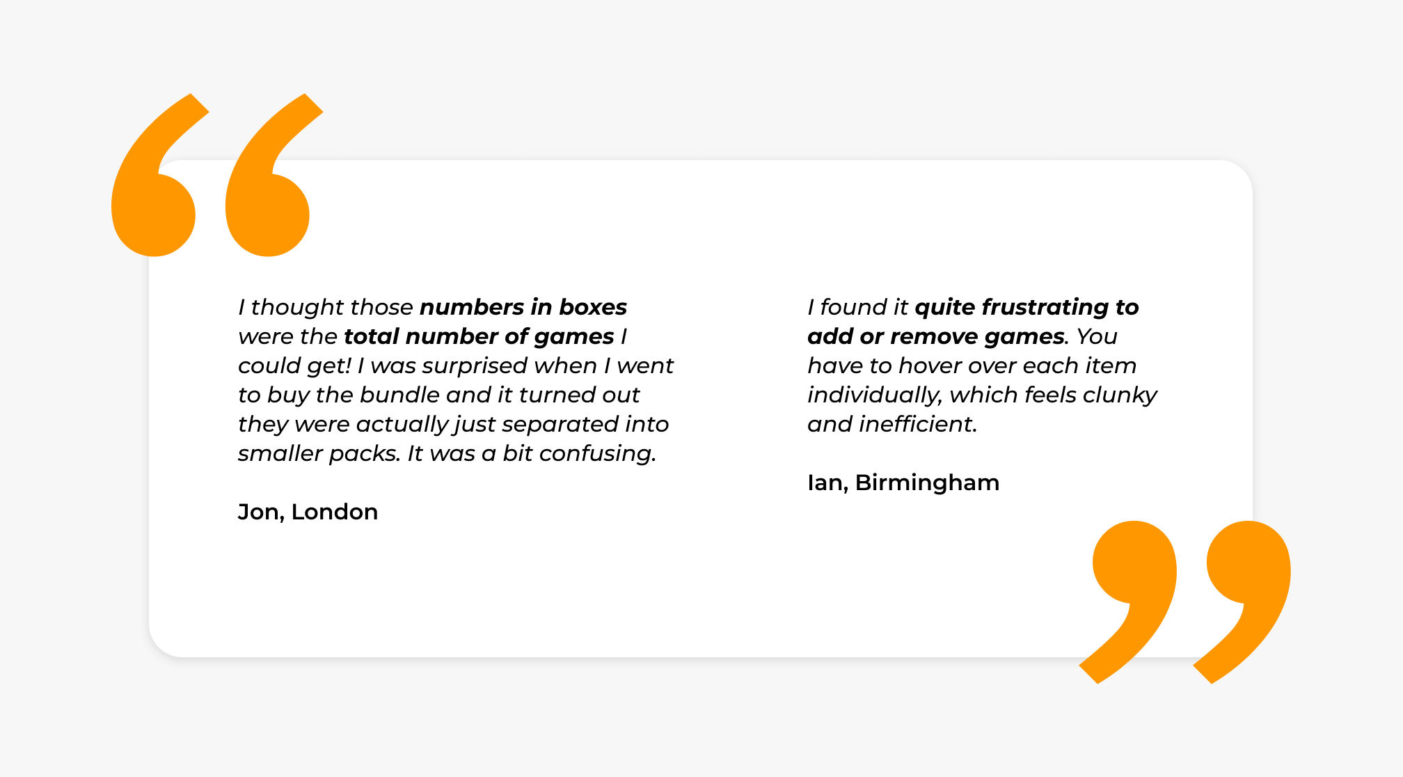
Design Improvements
The voluntary participation of dedicated users provided us with crucial insights into their experiences and needs. This enabled us to design a solution that aligned with both business priorities and user satisfaction.
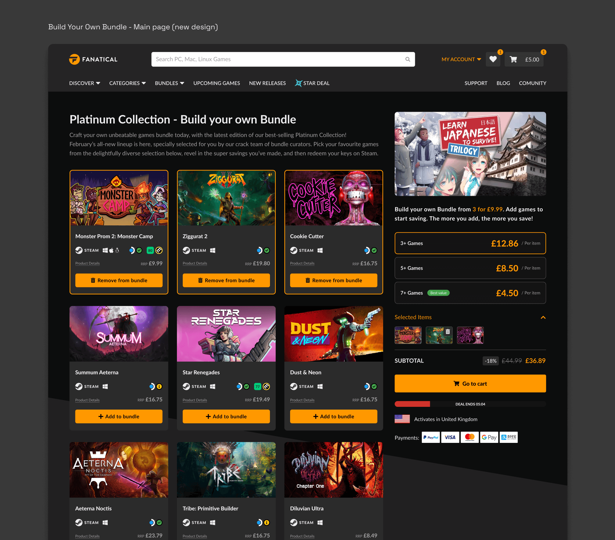
HMW reduce confusion and differentiate price tiers from buttons to prevent accidental clicks?
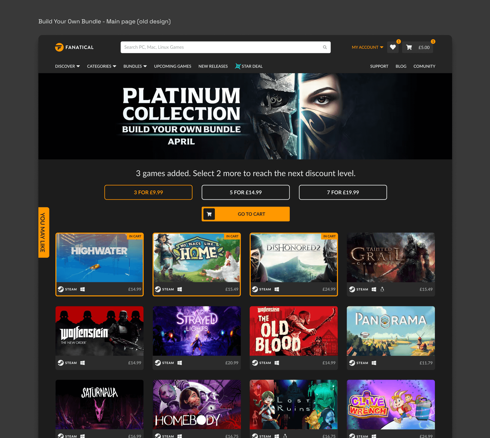
Before: The current pricing boxes are visually similar to buttons, leading users to accidentally click them. This, combined with the difficulty in clearly tracking the number of games added to a bundle, creates a frustrating user experience. The banner on the top takes up too much of the above-the-fold space, pushing games further down.
After: The new design features a sidebar that will follow upon scroll, displaying price per item in three tiers. This visual tool encourages users to spend more to reach the next price tier and unlock additional benefits. Additionally, a dropdown menu allows users to easily review their selected games. As the top page banner was redesigned to a sidebar, it allows games to be pushed to the top.
HMW reorganize the product details card to make it more accessible & relevant to users?
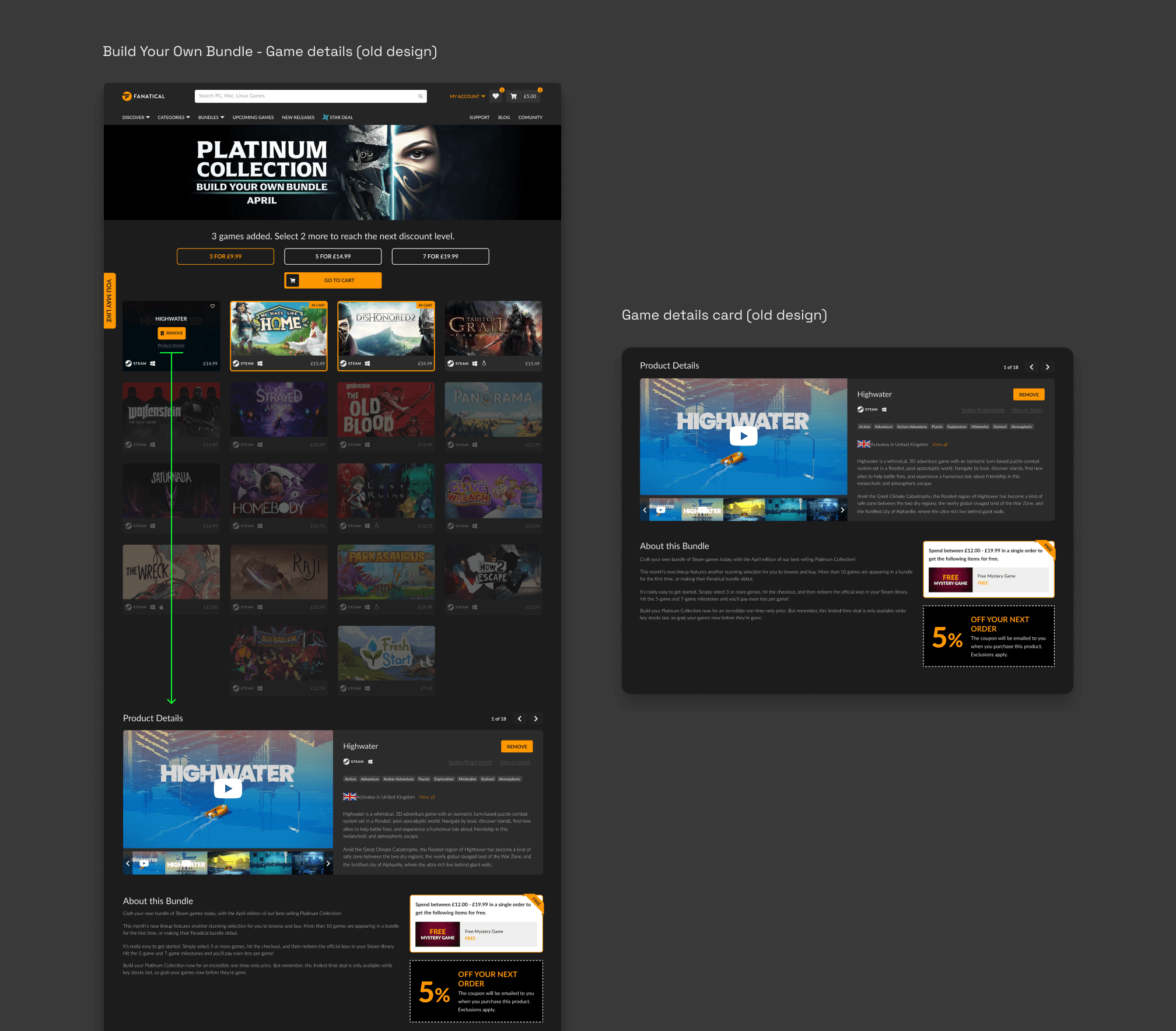
Before: To get the game details, users need to hover over the game card and click “Product details” link to be sent to the bottom of the screen, which is not ideal as some bundles have more than 60+ games. The game details card had no visual hierarchy that complicated access to information and the following decisions.
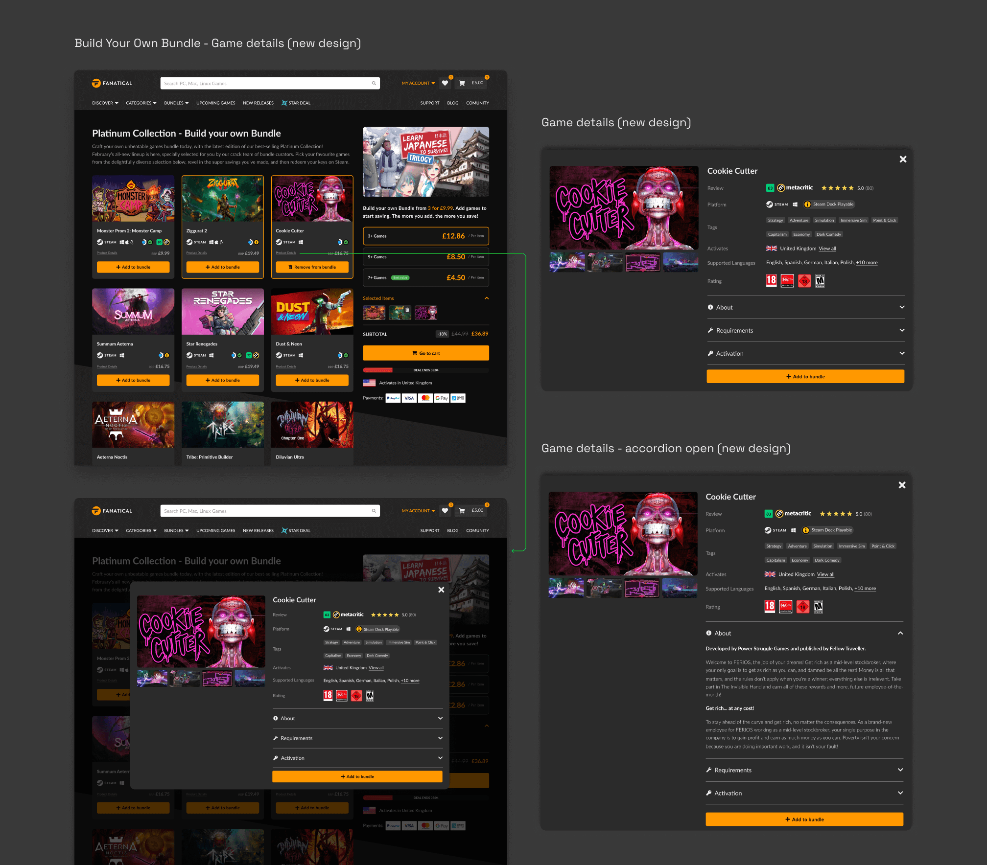
After: The game details card is presented as a pop-up with a dark overlay to reduce visual noise. The card itself has an information structure and an accordion that preserve infinite scrolling, as it was before, giving the user all the information they need to make a decision
HMW make the game title and add/remove game buttons more noticeable to users on first sight, without cluttering the interface?
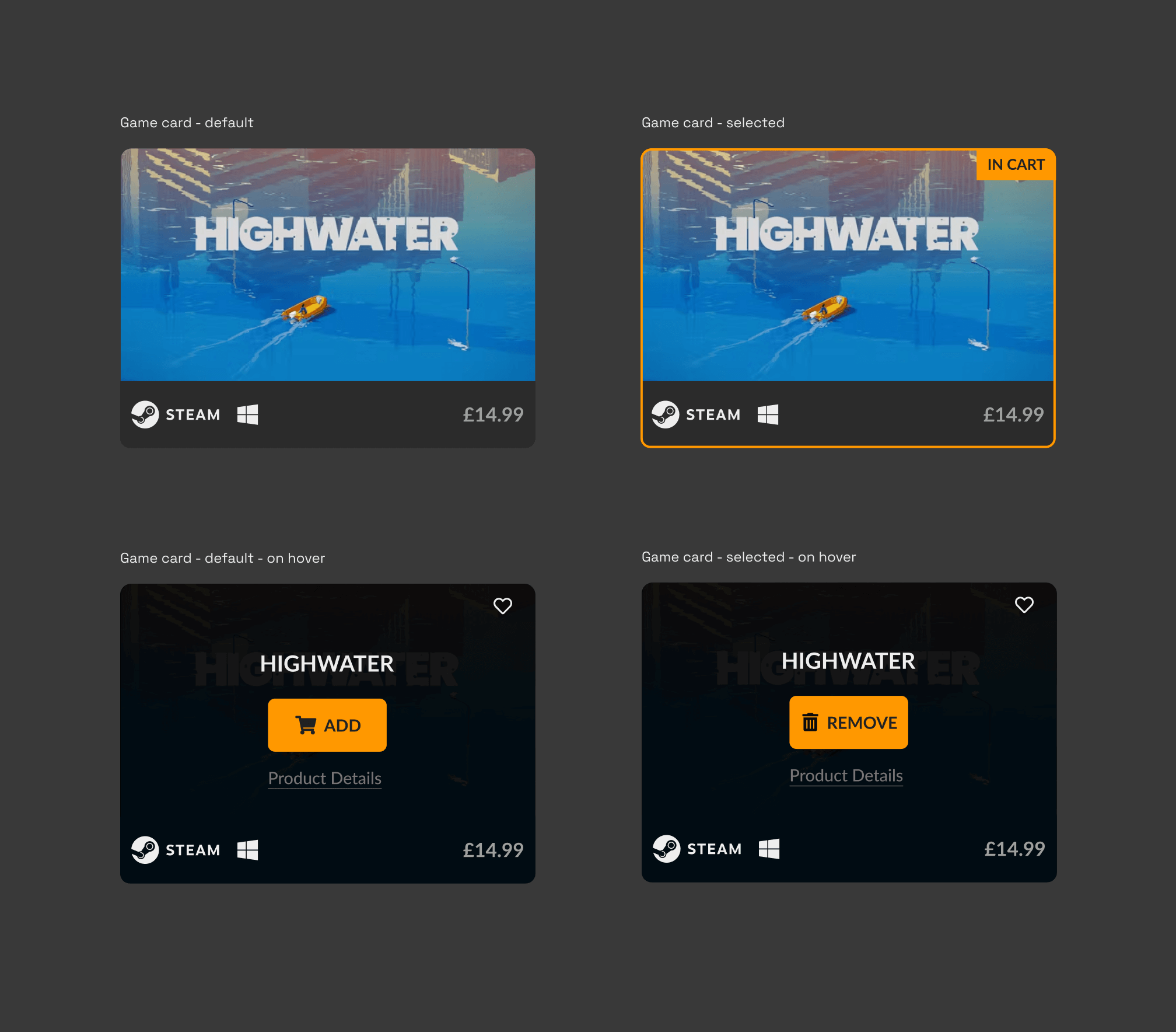
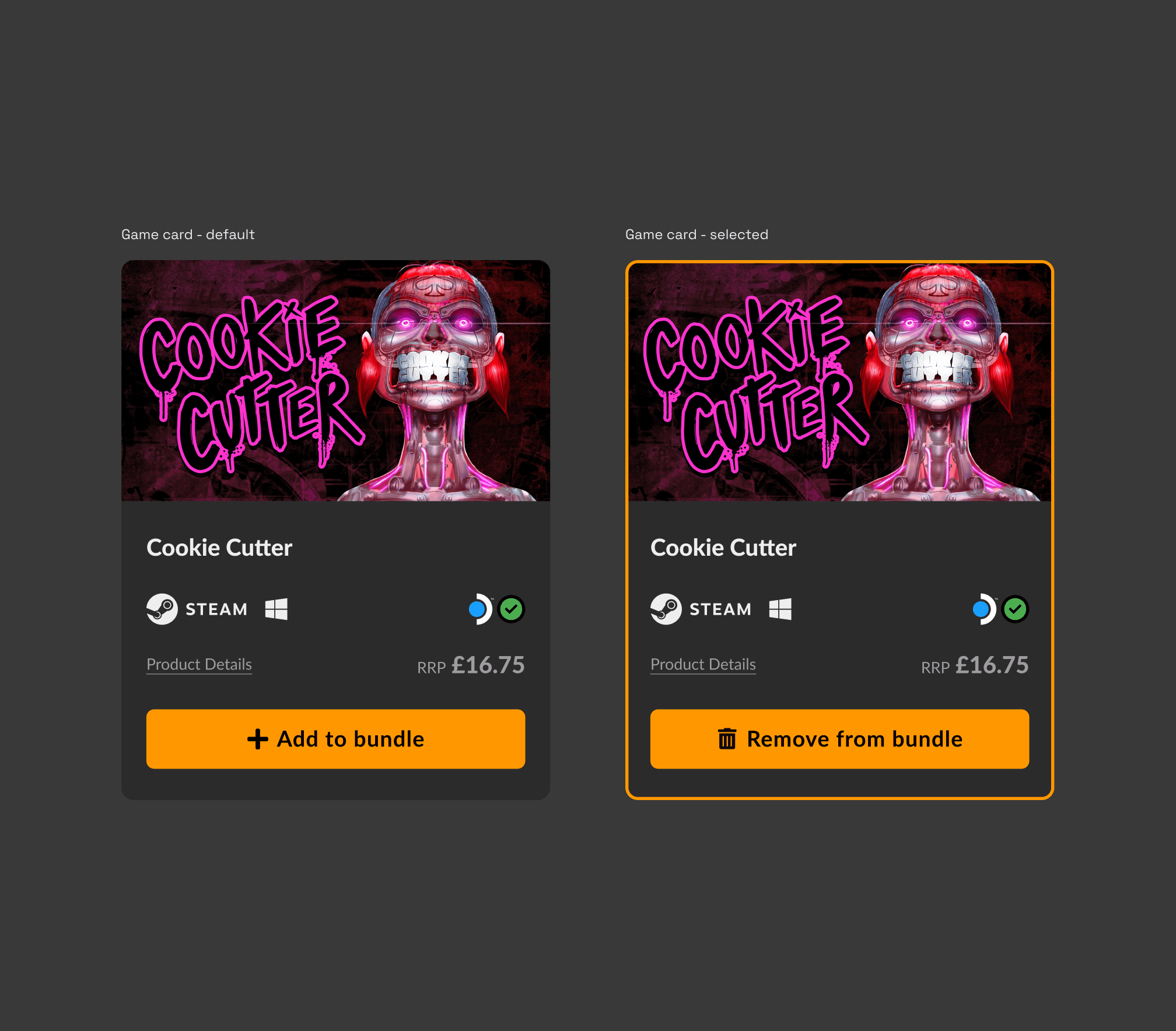
Before: Initially, game cards displayed no call to action or game titles. Adding or removing games required hovering over the cards. To remove an item from the bundle after adding it, users needed to hover over the card again.
After: All necessary game information, including a call to action, is displayed by default. When a game is selected, the button changes to 'Remove from bundle'.
HMW provide a more intuitive & efficient way for users to differentiate & edit their bundles in the cart?
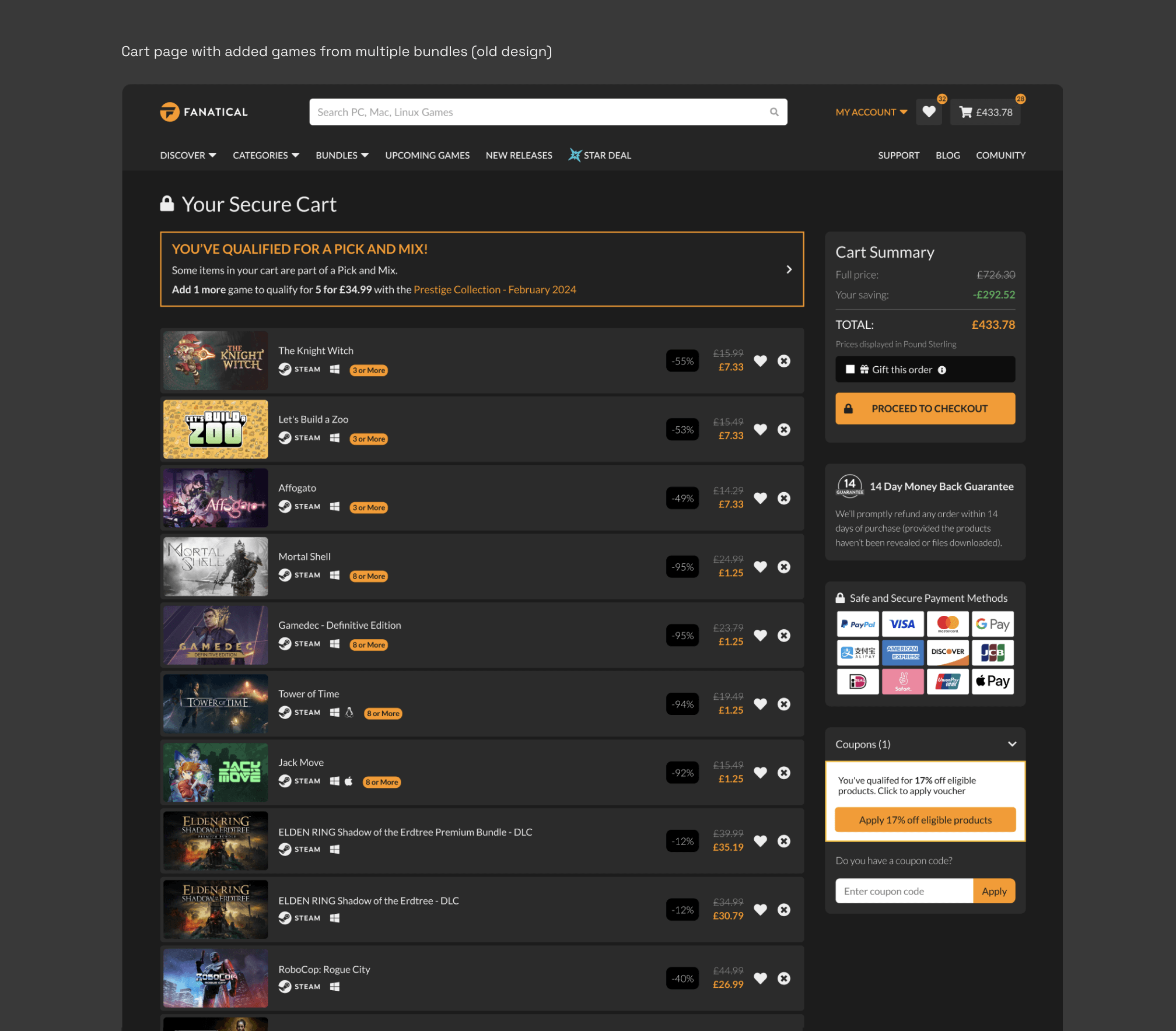
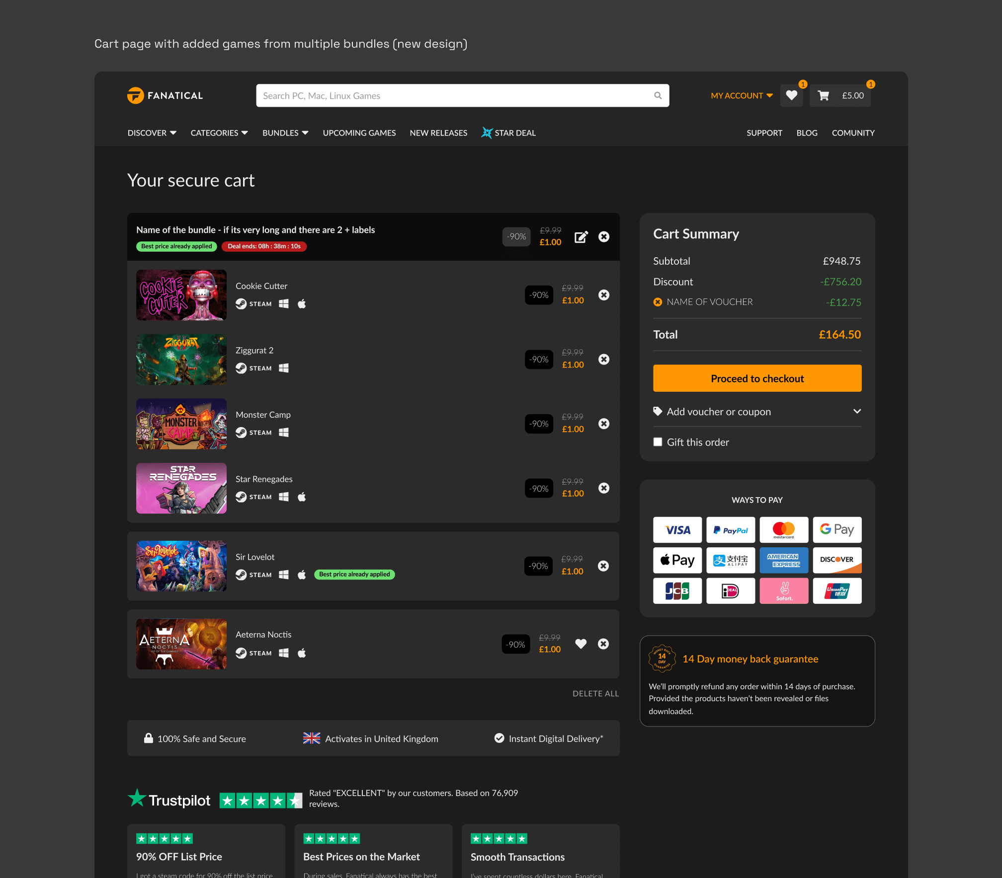
Before: The cart page was presented as a list of added items. Each item might have none, one or multiple tags. Once users added games from a bundle, there was no clear understanding of which games belonged to which bundle, making it difficult to add or delete games from a bundle and track price differences.
After: The new bundle grouping solved the problem of multiple tags by presenting all relevant tags at the header of the bundle. This also provided a clear understanding of which items were part of the bundle, making it easier to edit the bundle.
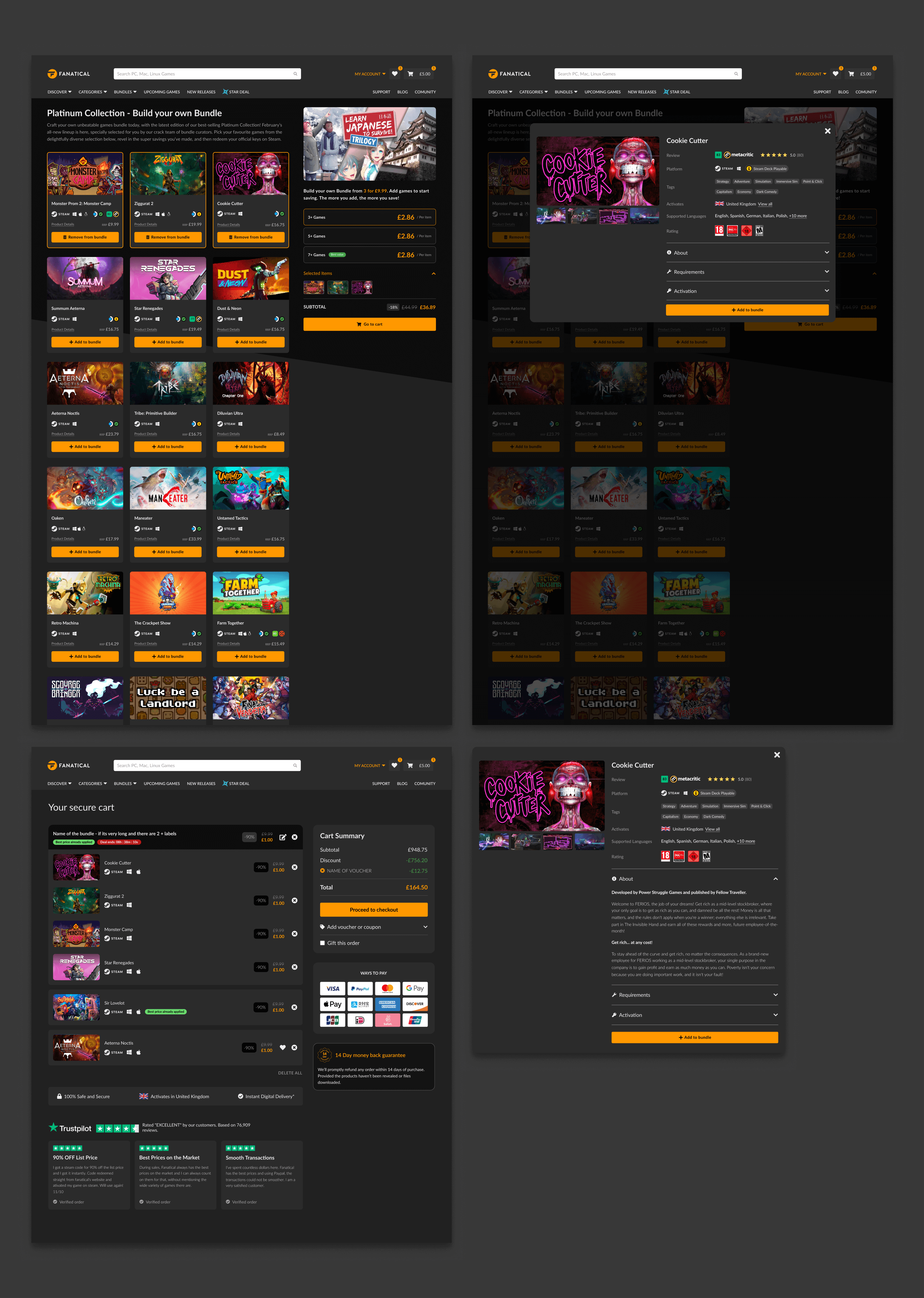
Here are the following pages presented: Build Your Own Bundle (product page); Game Details Card (popup); Build Your Own Bundle (in-cart grouping); Game Details Card (accordion open) ↓
Outcome
Following the redesign, A/B tests conducted on the Redash platform demonstrated a positive impact on conversion rates across the board for the new BYOB page. The tests quickly reached statistical significance showing the following results:
+7.2%
All Users
+11.6%
New Users
+6.9%
Returning Users